Case Study
Microsoft Learn at Ignite
Most trade show booths are designed to be seen. This one was designed to be used.
Most trade show booths are designed to be seen. This one was designed to be used.
Microsoft was launching Learn Azure — a hands-on training program designed to drive adoption at scale. The venue was Microsoft Ignite, their own flagship conference, with tens of thousands of attendees and hundreds of competing booths on the floor.
The brief wasn't "build a booth." It was: drive real Azure learning completions, on the show floor, in four days.
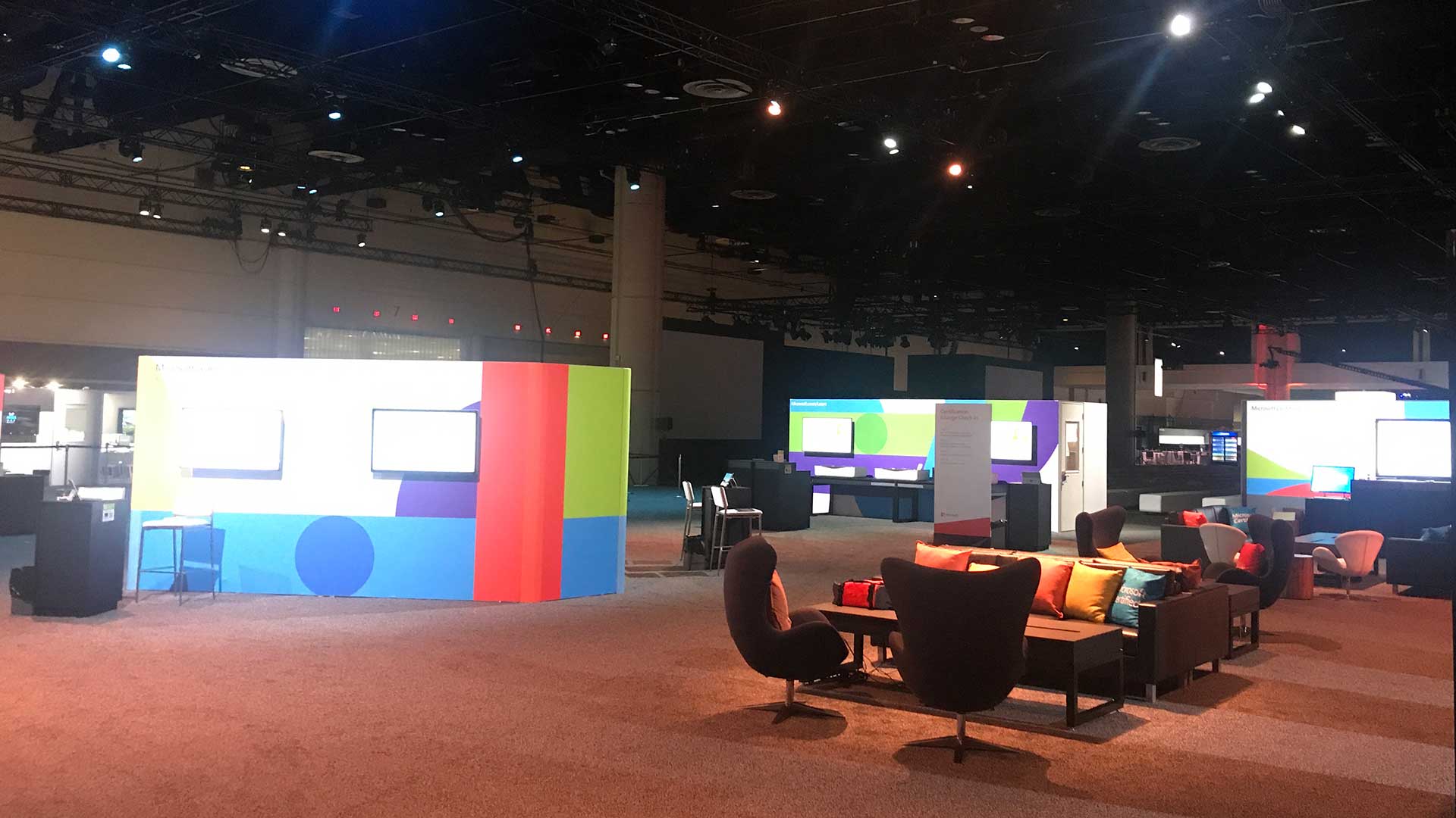
Before a single piece of fabrication was ordered, the entire booth was designed and visualized. Every zone, every activation, every flow path. The previz established the spatial logic that everything else was built from.
Every activation in the booth was engineered around one insight: dwell time drives outcomes. The longer someone stayed, the more likely they were to complete a learning path, sign up for Learn Azure, and leave with something real.
So we designed for depth, not throughput. Instead of a booth that moved people through, we built one that gave them reasons to stay, and a system that rewarded them for doing so.
The claim card mechanic tied it together: attendees who completed multiple activations earned tiered swag rewards, redeemable at the swag station. It turned a visit into a journey.
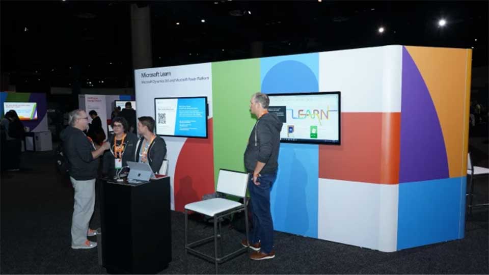
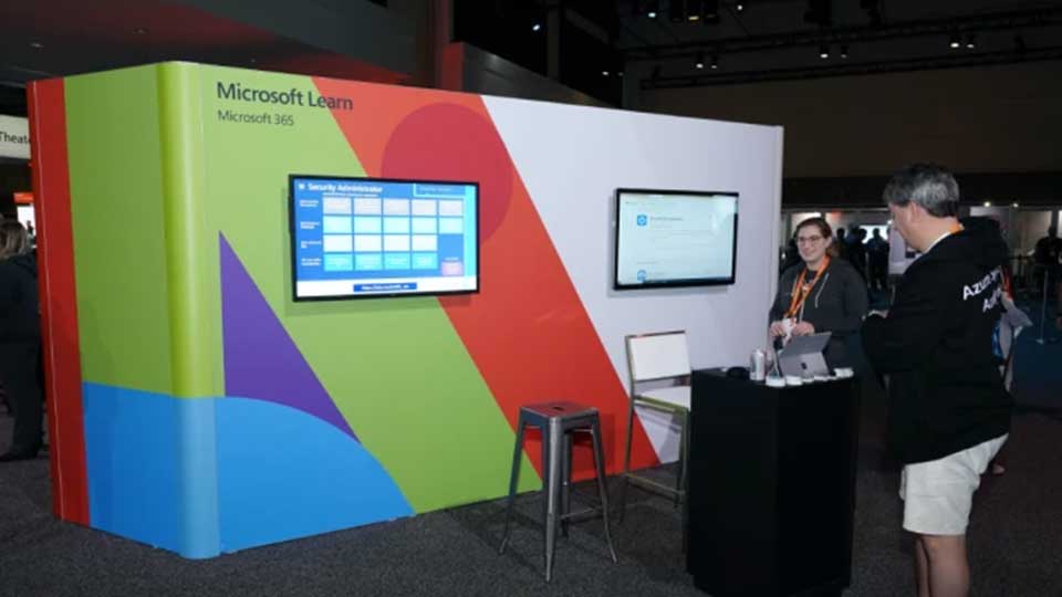
A large-scale physical flipboard cycled through curated Microsoft Learn collections, each tied to a recognizable name in the Azure and Microsoft community.
It pulled people in from across the floor and kept them there. For four days it ran continuously, and people kept stopping to interact with it.
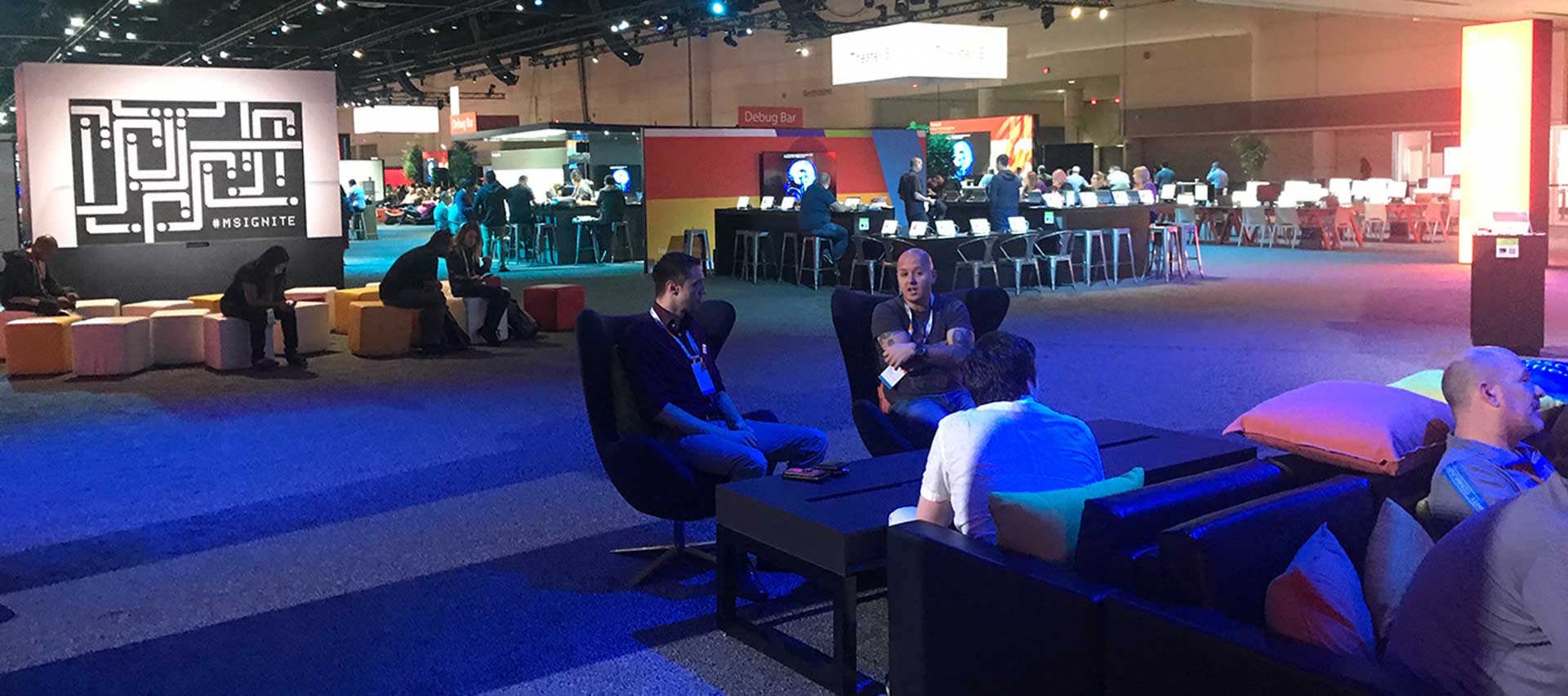
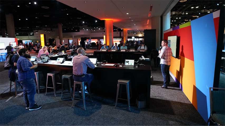
The U-shaped arena ran two modes. When a game show or quiz was live, it was a real production: a live host, Azure knowledge questions, competitive scoring, and a crowd that built itself. The kind of activation that makes passersby stop because they don't want to miss what's happening.
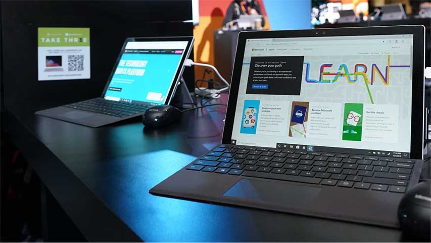
Between sessions, the same space became a hands-on lab. Attendees could sit down, open a device, and work through an actual Azure learning path. The physical design made both modes feel like they belonged there.
Two activations were designed specifically to solve problems that most booths ignore entirely.
The Email Yourself stations addressed the trade show follow-through gap: at the moment of peak interest — inside the booth, engaged with the content — attendees could email themselves a summary of what they wanted to learn and do next. No lost leads. No forgotten conversations. The information found them after the show, in their own words.
The laser cutting station created something worth waiting for. Custom swag cut on demand, with a line all four days of the conference. Complete more activations, earn more. It kept people moving through the space rather than in and out of it.
A live counter was mounted visibly in the booth, ticking up in real time with every completed Azure learning path. Every attendee who walked past could see the number.
By the end of four days, it had passed 10,000.
That number wasn't a function of foot traffic. It was a function of every design decision made before a single piece of fabrication was ordered. The counter just made it visible.
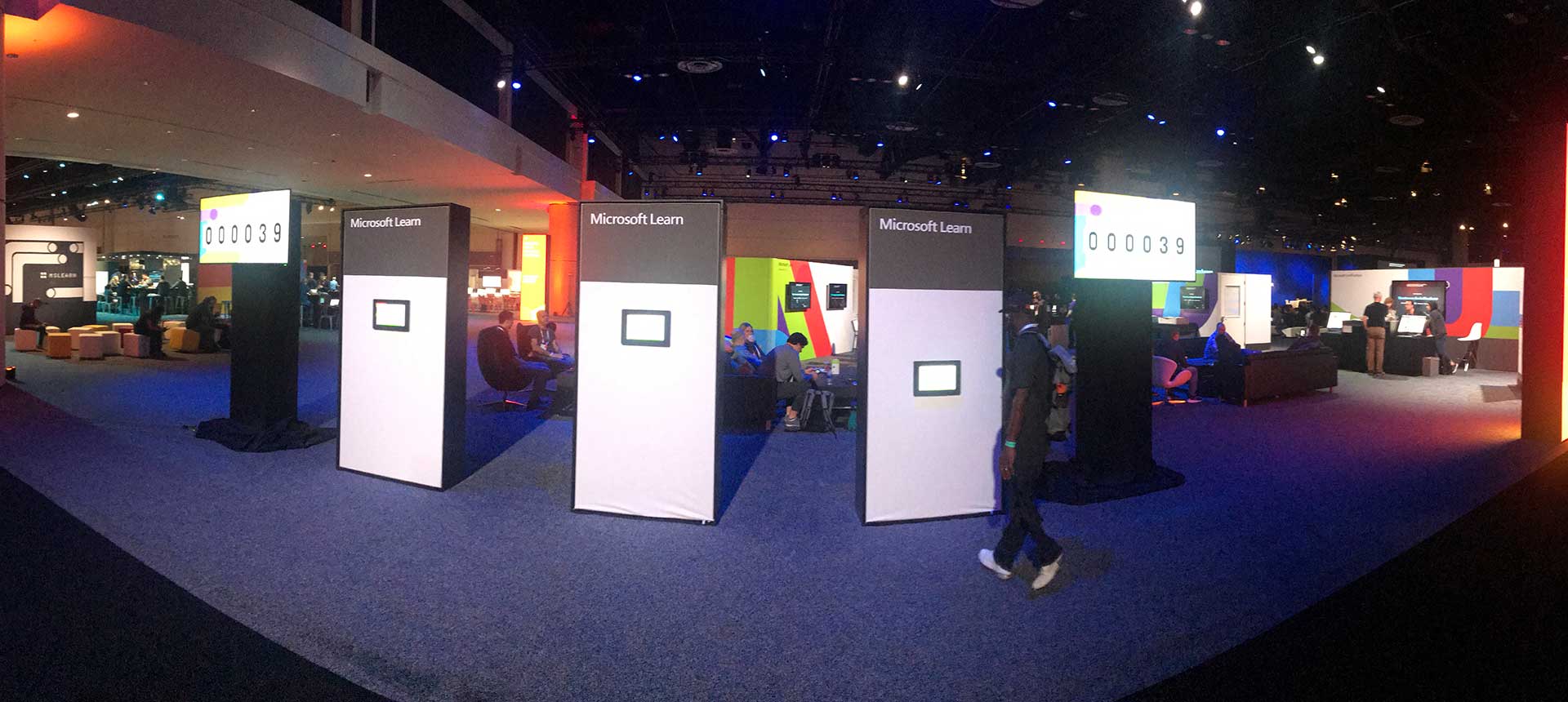
Most trade show booths measure success by badge scans. This one measured learning completions and hit five figures in four days at one of the largest technology conferences in the world.
People stayed because the booth gave them reasons to. That's what happens when every activation is designed around an outcome instead of an appearance.
50×50 ft spatial design, color system, wall graphics, zone identity, environmental signage
Flipboard wall installation, learning arena layout, email-yourself station UX, game show format
Claim cards, tiered reward system design, custom laser-cut swag, swag station
Live learning completion counter, hands-on lab coordination, four-day activation management
Delivered as Creative Director while at Catalysis.